The Viewer Panels
Before we get into the lesson on Motion Tracking, let's take a walk through more of Fusion's interface. We have already had an overview of the Viewers, the Flow view, the Tools view, the toolbar, and the playback controls. There are quite a few other views and functions that you will find very useful as you grow as a compositor. Let's start with all of those buttons at the bottom of the Viewer:
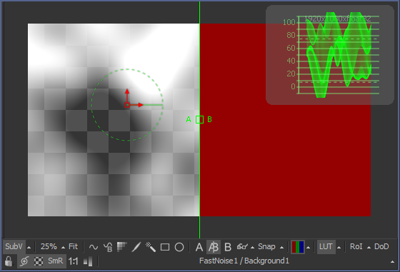
Starting with the upper-left, we have the SubView button, labeled "SubV." This button turns on an information panel overlaid on the Viewer, as you can see in the upper-right corner of this image. Right now, it's set to display a waveform monitor, a very useful tool for viewing the luminance range of your image. The small triangle next to the button activates a pop-up menu, which you can use to choose the specific SubView you want to see.
Next, the Zoom controls. In this image, I have set the zoom to 25% in order to see my entire image in the very small space I intended to clip out. Next to that is the Fit button, which scales the active image to fit exactly in the Viewer.
Next comes a row of buttons that can be used to quickly create masking tools. Polygon, B-Spline, Bitmap, Paint Mask, Magic Wand, Rectangle, and Ellipse.
Each Viewer has two display buffers: A and B. You can load a different image into each buffer by first selecting either A or B, then putting the image in the viewer. The A|B button splits the image and gives you a wipe control, so you can see both of the images simultaneously, as I have done here. The divider between the two images can be rotated around the handle by dragging the vertical line. The default hotkeys for switching between buffers are , and . (comma and period).
To the right of those is a small 3d glasses icon, which activates the stereo viewer mode. Most of these modes assume you are using anaglyph glasses, but it is also possible to set up a stereo monitor for use with Fusion.
The Snap function allows you to place tools precisely on either pixel corners or centers. I have never used this feature. In fact, until I started writing this article, I had never even noticed it was there. If you do not require sub-pixel accuracy in, for instance, a Transform, turning on Snap might improve the final image quality by reducing how much filtering is performed.
The next two buttons are ones you will use frequently. The Channels pop-up menu allows you to look at the individual Red, Green, Blue, and Alpha channels of your image separately. You can also view various auxiliary channels, like z-depth or motion vectors. Just clicking the button toggles between viewing the color image and the alpha channel. Hotkeys for viewing the main channels are R, G, B, A, and Z for Red, Green, Blue, Alpha, and Depth. The LUT button controls how the Viewer interprets the pixels before displaying them on your screen. Typically, you will choose the color gamut of the screen (sRGB for most of us) and just leave this button on, switching it off only when you are looking at an image that is already sRGB.
Region of Interest (RoI) allows you to isolate a portion of the image and only render those specific pixels. For very complex comps or very large images, this can save you a great deal of time since you can focus it on only the small bit of the composition you are currently working.
DoD displays the Domain of Definition. If you have active pixels that are outside of the canvas, the DoD button will show you a frame indicating the extent of the information Fusion is actually processing. This button is useful for troubleshooting cropping problems and slow performance.
Moving down to the second row, we have the Lock View button, which appears as a tiny padlock. Activating this button prevents Fusion from updating the Viewer. This can be useful if you have a heavy comp and don't want the Viewer to update until you are done changing several settings, or you wish to easily compare a before-and-after of your change using the A/B buffers. Most of the time, you will find the button's primary use is to inform you that you've accidentally locked your Viewer with the Ctrl+L hotkey.
The peculiar-looking icon next to the padlock toggles the visibility of controls in the viewport. Note, for instance, the Transform controls visible in my screenshot. If I were to turn off the Show Controls button, those widgets will vanish. Useful when the controls are in the way but you don't want to deselect the active tool just to make them disappear. This button can also hide the wipe controls when the A|B button is on, letting you see the two buffers right next to each other without that distracting green line. The hotkey for Show Controls is Ctrl+K. This button does not appear in the 3D Viewer, but it still affects it—if you can't see transform handles or the icons indicating your lights and camera, Ctrl+K will probably bring them back.
The next button toggles between a black canvas and a checkerboard to show the transparent areas of your image. As you can see from my screenshot, the FastNoise tool I have displayed in the A buffer is transparent in many areas, allowing the checkerboard to show through.
SmR means Smooth Resize. It toggles the resampling filter used when zooming the image. When Smooth Resize is on, the zoomed image gets a linear filter. When it is off, the image uses the Nearest Neighbor method. Turning this button off can be helpful if you need to view a zoomed-in image with pixel-perfect accuracy, though you should only do so when viewing at multiples of 100% to avoid aliasing artifacts.
The 1:1 button turns off pixel aspect correction. An image with non-square pixels will appear squashed or stretched.
The Normalize button remaps the values in the viewport to stretch them from 0 to 1 (black to white). This is most often useful when you try to view a channel with information outside of the range of normal images. Z-depth channels, for instance, often encode the actual distance from the camera as the value of the pixel. An object 4000 centimeters away will therefore have a color value of 4000. Normalizing brings all of the values into the viewable range. If you notice your clip's brightness flickering unexpectedly, check to be sure Normalize is off.
Finally, the currently viewed tool button will select the tool in the Flow view. If you are in A|B mode, as in the screenshot, it will select both tools. The pop-up button allows you to choose which viewport control is the currently active one, which can allow you to move the pivot point of a Transform without having to go to the control panel to move it out from under the Center control first. You can also cycle through the widgets using Tab.
There are three ways of putting a node's output into a Viewer: The small black circles at the bottom of each node are linked to the Viewers. Clicking one of the circles puts that node into its associated Viewer. Usually there are just two such circles, but you can add a new Viewer to any panel by right-clicking the tabs at the top of the panel and choosing Add View > Image View. The second method is to drag-and-drop the node into the Viewer. The third is to select the node and hit the number key associated with the Viewer: 1 or 2 for the default Viewers, 3 or higher for additional Viewers.
Whew! That's a lot of information about just one panel! Don't worry, the rest of the panels are very simple in comparison, and I will save most of the details for later chapters, as we start to use them more extensively.
The Console
![]() In the upper-right corner of the Flow view are several tabs. The first, and currently selected tab, is the Flow view itself. Next that is the Console, which might have a little "i" or alert icon (as displayed in my screenshot) on it indicating that there is new information to be seen there. Clicking over to it reveals a pretty simple window.
In the upper-right corner of the Flow view are several tabs. The first, and currently selected tab, is the Flow view itself. Next that is the Console, which might have a little "i" or alert icon (as displayed in my screenshot) on it indicating that there is new information to be seen there. Clicking over to it reveals a pretty simple window.
This is Fusion's command interpreter, where you can do some scripting and receive feedback on the operation of your composition. The row of buttons at the top are Cls, which clears the console of existing messages; filter buttons that can turn off reporting of errors, log messages, script feedback, and input feedback; and the Lua / Py2 / Py3 buttons, which change the scripting language between Lua and Python. Fusion's default scripting language is Lua, but it can also use Python if it's been installed (make sure your install the correct 64-bit version of Python). We'll talk more about scripting later on.
Most of the time, you will only use the Console view to check for errors. When an error has occurred, a yellow triangle with a ! will appear on the Console tab, letting you know that you should check it. You might also see a pink gear icon, indicating that a script has printed a message in the Console.
When you first go to the Console window, there is likely a brief tip about using Fusion. If you want another such tip, place your cursor in the command line at the bottom of the window and type tip to receive a new one.
The Timeline
The Timeline view is part After Effects and part dope sheet. It can show all of the tools in your composition, or just the selected one(s), what frame ranges they are active over, and where their keyframes are. We'll be talking quite a bit about time in the next chapter, so I will hold off on an in-depth explanation of everything here until then.
The Spline View
This next view is a curve editor, where the interpolation between keyframes can be controlled with great precision. Once again, there are many controls here that will make more sense in the context of later discussions. We'll come back to this view in just a little while when we start talking about the Tracker.
The final two tabs in this window are the Comments and Generation Integration. Comments is simply a place where you can leave notes that will travel with the Composition. You might use it to jot down some reference on Expressions you're using or document an unusual approach. Since the comments are tucked away behind a tab that few people access, though, I wouldn't try to use it to pass information to other artists. There is a Sticky Note tool that can be used to do that right in the Flow View. Generation Integration only functions in Fusion Studio. I am not as strong with Generation as I am with Fusion itself, and Generation has been deprecated in favor of the new Bin Player in Fusion 9 Studio, so it's fairly safe to ignore that tab.
The Modifiers Tab
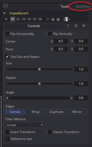 The final piece of the GUI we'll talk about today is the Modifiers tab, which can found the right-hand column, right next to the Tools tab.
A Modifier is an extension of a regular Tool. Modifiers are most commonly used to create procedural animation. Right now, the Modifiers tab is empty, but if you right-click a control on a Tool, and point to Modify With >, you will get a list of available Modifiers that you can use to automatically create variation in that control.
By the way, you may have noticed that I upgraded to Fusion 8 in the middle of this article. We finally started making the switch at work, so I did so here at home as well. Eventually I will go back and retrofit the previous chapters and screenshots.
Well, with that out of the way, let's get to the meat of this article!
Tracking
In the last lesson, we placed a gargoyle on the ledge of a house in a locked-off (unmoving) shot. If we had zoomed or panned that image, it would have been much more difficult to integrate the gargoyle because we would have had to animate its size or position. While you can certainly do that with keyframe animation, Fusion (and other compositors) provides an automated solution for capturing motion and applying it to an element. The process is called point tracking. There are some other kinds of tracking, planar and 3d tracking, but those are advanced new features available only in the Studio version of Fusion 9. I will talk more about them at the end of the chapter.
Once again, if you have footage of your own you'd like to work on, I encourage you to do so. If you want to follow exactly the same steps I use, here's a clip from one of my student films (most of which will never see the light of day if I have anything to say about it): 003_tracking-plate.zip (43.7 MB)
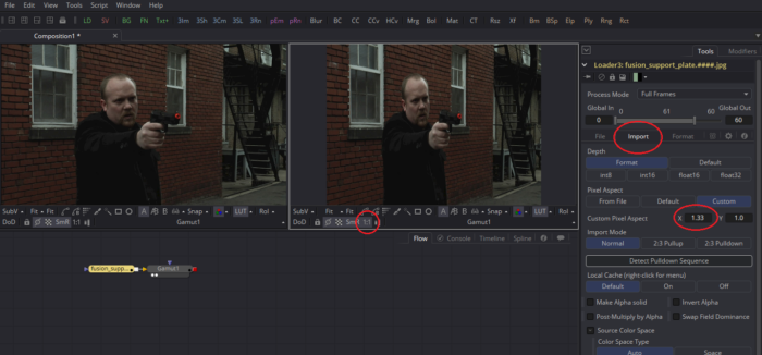
This footage was shot with a Panasonic HVX200a camera, which records non-square pixels in order to save storage space, so the image will appear horizontally squashed. If you need to preserve the original pixel aspect ratio (PAR), you can set the ratio up in the Loader.
Click over to the Import tab in the Loader and change the Pixel Aspect multi-button to "Custom." The HVX200 has a pixel aspect of 1.33 : 1, so put 1.33 in the X field. In the screenshot above, the corrected image is in Viewer 1. The same image is in Viewer 2, but I have turned on the Show Square Pixels button, which shows me that I am, in fact, still dealing with a squashed image. Fortunately, Fusion is smart enough to compensate for the pixel aspect ratio all the way down the pipe. If two images with different PARs are combined, the composite will be conformed to whichever is in the Background input.
If you don't care about preserving the ratio (ask your supervisor!), I recommend using a Resize immediately after the Loader to make the image 1280×720. Incidentally, you can also set the PAR in the Resize node, but don't do both that and change its dimensions, or you'll wind up over-stretching it!
Tracking the Gun Muzzle
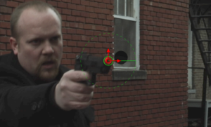
Now, let's get on with the actual task at hand: Tracking. My actor, James Felix, is aiming an Airsoft pistol, which has the orange tip on the barrel so it cannot be confused with an actual firearm. Obviously, we'd prefer him to be wielding a real gun, so we're going to replace the orange with a black barrel. To do so, we need to be able to precisely match the gun's motion.
First, create a Tracker node using either the right-click context menu (it will be found in the Tracking folder) or the Ctrl-space menu. The Tracker was designed before linear workflows were in common use, so it tends to work better in a gamma-corrected space. This footage, by the way, looks best in Rec.709 (Display referred). In your Gamut tool, that's ITU-R BT.709 (display). It will probably look very crunchy in the blacks because it's also an 8-bit Integer image. Use a ChangeDepth node before the Gamut tool and choose float16. That will give Fusion enough data to work with to create a pleasing conversion. It doesn't look great by any means, but it's as good as I could get with equipment borrowed from my University.
Connect the Tracker to the Resize node (or directly to the Loader if you are using the PAR adjustment. In your Viewer, you should see a green rectangle labeled "Tracker 1." This box will keep track of any pixels within its boundaries and, on each frame, will try to find those pixels and reposition itself on top of them. If you put your mouse over the box, a larger, dotted rectangle will appear. This larger box is the search area. Fusion saves time by only looking within this large box for the pixels in the small box. If the object you're tracking is moving large distances, it might be necessary to make the dotted box bigger by dragging its corners outward. For this shot, the default size is fine.
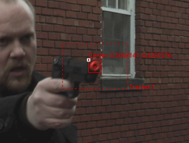 Move the pattern rectangle over the orange barrel of the gun by grabbing the handle on the upper-left corner. You can see the handle highlighted in white in my screenshot. If you drag any of the other corners, you can resize the pattern box. I have tightened it up around the barrel of the gun so that the window frame behind it doesn't interfere with the track.
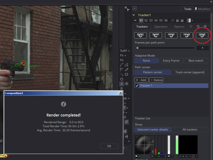
In the Tracker's control panel, there is a row of esoteric buttons with crazy twisted arrows. In order from left to right, they will track the image from the end backward, from the current frame backward, stop tracking, track from the current frame forward, and from the beginning forward. Assuming your playhead is still at the first frame of the shot, click the right-most button.
You will likely see the Tracker box dance around for a few seconds, then you'll get a window telling you the process was completed. There is now a green path in the Viewer showing you how the barrel of the gun moved. If you play the footage, you should see the transform widget stick to the barrel. If the track didn't work out, try changing the size of your pattern box or moving it slightly. Sometimes it can help to color correct or otherwise manipulate the image before tracking to give the software some help.
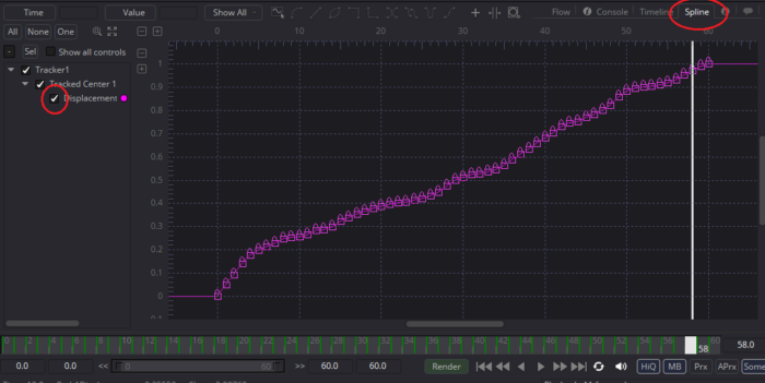
Now that the track is complete, we're going to manipulate it a little bit. First, switch over to the Spline view to see what the Tracker's keyframes look like. You'll have to select the Displacement property in the left-hand column to get the keys to appear.
Fusion's default for Tracker and Transform keyframes is to display only a displacement value from the original location. That is, it only tells you how far the point is from where it started, but not in what direction. While this can give us an idea of the velocity of the motion (a steeper slope means greater velocity), it doesn't help much if we decide the path needs to be nudged for some reason. In order to make the Spline view a little more useful, we're going to convert this displacement curve to X- and Y- coordinates.
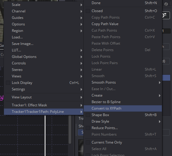
Right-click in the Viewer to bring up a context menu. At the very bottom is a reference to the path the Tracker created, called Tracker1Tracker1Path:Polyline. Pointing to it calls up an even bigger menu. Click on Convert to XY Path.
The displacement keyframes in the Spline view will be replaced with more familiar X- and Y- curves. Of course, this track was so easy that we probably don't need to use these curves, but it provided a good opportunity to look a little bit at the Spline view. This is also a good time to look at the Timeline view. Click over to that, and you'll see a list of the tools in your comp. Notice that there are hash marks on the Tracker line. These indicate the keyframes on the tool. If you click the little disclosure triangle next to the word Tracker to spin it down, you will see the X- and Y- channels with their keyframes. We'll come back to both of these panels in a later chapter for an even deeper look.
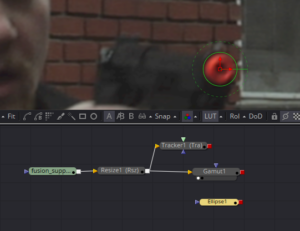 Click back over to the Flow view, and we'll learn how to apply the tracking data. In visual effects, the faster you can work, the more money you can make, so it's usually a good idea to try the fastest and simplest solutions first. Since painting a black gun barrel will take a little time, let's see if we can fix this shot with a color correct first. We want to isolate the gun barrel so that the correction only applies to it, so go back to the first frame and make an Ellipse tool. Put the Center widget right in the middle of the gun barrel, and drag the Ellipse's edge inward so that it just contains the orange pixels, including the blurry edge pixels.
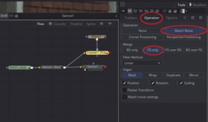 This Ellipse will serve as a mask for the Color Correct. Plug the output of the Ellipse into the Foreground of the Tracker. Leave the Background connected to the footage. Then select the Tracker node and switch to the Operation tab. Set Operation to Match Move; the Merge panel will appear. Set the Merge to FG only. In this mode, the position data from the single tracking point will be applied to the pixels in the Foreground input, and only the Foreground will be sent to the output.
Put the Tracker in the Viewer. You will see the white circle move about just like the barrel of the gun.
The next step is to use make a Color Corrector (CC) node, attach it to the footage, and put the output of the Tracker into the Mask (blue) input on the CC. Any tool in Fusion can be masked in this fashion, restricting its operation only to the parts of the image where the Mask is white.
 In the CC node, pull the Master – Saturation control down to 0.0 to get rid of the orange color and the Master – RGB – Gain control way down to reduce the brightness. Looking at the result, we see that we have a problem!
My Ellipse looks like it's in the right place, but the color correction is happening somewhere else. What's going on here? It was a bit of an accident that this error showed up, but I am glad it did because it's one of the more bewildering aspects of Fusion's transforms.
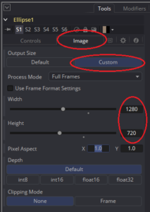 Fusion's position controls are always relative to a percentage of the image size. A Transform's Center control is at (0.5, 0.5), or half-way from the bottom and the top of the image. When you try to combine images that are different resolutions, the results can be unpredictable. In this case, my project's default resolution is full HD at 1920×1080, but my footage is half HD at 1280×720. The controls show up right where I expect them to, but the pixels are offset because the Ellipse tool is larger than the footage it's being Merged onto. Fixing it is as simple as changing the size of the Ellipse in its Image tab. Once that's done, the Color Corrector affects the pixels we expected it to. You could also go to the composition's Preferences and set the Frame Format to match your Loader's dimensions. All masks, Backgrounds, and other creator tools will automatically match that preference.
Sometimes you will want to apply motion from a Tracker or a Transform node to an image element of fixed size that doesn't match the resolution of the Background. A Crop tool can be used to set the resolution of the element to match. If you're making the image smaller, change Clipping Mode to "None," or the Crop will destroy any pixels that fall outside of the new frame, which is usually not what you want.
Experiment with the controls in the CC for a while until you're either satisfied with the picture or convinced that it just isn't going to do the job. If I cover all of the blurry orange pixels, I wind up with an unnatural-looking fuzzy black halo, which is not what I want. It's okay to fail in your first attempt to accomplish a task. Don't hang on too long to an approach that isn't working; move on to a new solution as soon as it's obvious that the current one was a bad idea. In this case, I'm going to try the HueCurves tool instead of the Color Corrector. By now, I expect you know how to find a specific tool, so I'll stop holding your hand.
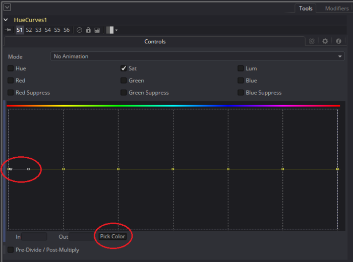
HueCurves provides a way to perform color corrections that target specific color ranges. It has several modes accessible with the grid of checkboxes at the top and a curve interface that you can use to isolate the hue that you want to work on.
Whenever I work with a curve tool in Fusion, I like to drag my Tools view as wide as is practical in order to get better precision. That's why this tool screenshot is thrice as wide as the others. You can also access curves like these in the Spline Editor, which provides even more precision.
You can add a control point anywhere on this spline by simply clicking on it, but in order to find the exact hue we need to change, I used the Pick Color button. To use it, you have to click+drag the button to the Viewer and release it on the pixel you want to sample. When you do so, you will get a new control point on the spline at the hue you sampled.
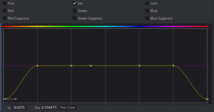
I have left the Tool in Saturation mode for now because I know I want to match the black gun color. I grab the new control point and pull it downward. Due to the presence of another control point very close to the one I set, the correction wasn't as wide as I need it to be. Fortunately, I can just select the other point and remove it by hitting the Delete key.
Notice that the curve wraps around to the other side because Hue is a radial quality, like the degrees of a circle. Since the tool is masked, there is no need to be terribly precise with the curve. If you're desaturating too much of the brick, though, you can sample its color to set another control point and use that to tighten up the correction. 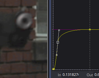 Here you can see that I've done exactly that. I've disconnected the mask so you can see that the Hue Curve is affecting only the gun and not the similarly-colored bricks behind it. The isolation isn't perfect, though. There's a little bit of the orange fringe creeping back in, and the bricks have been ever so slightly desaturated, so I will reconnect the mask and push that second control point a little to the right.
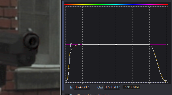
Next, deselect Sat and select Lum in the checkboxes at the top. The previously set curve is still active, and you can see that it still shows up in the graph, but now you can't manipulate it any more. Now we can affect only the luminance of the color in question. The hue is the same, and a similar curve gets us a result like this:
It's still not great. The barrel itself is about the right color, but the shadowed areas under the slide and inside the muzzle are too dark. A Color Corrector after the Hue Curves, given the same mask, can finish the job.
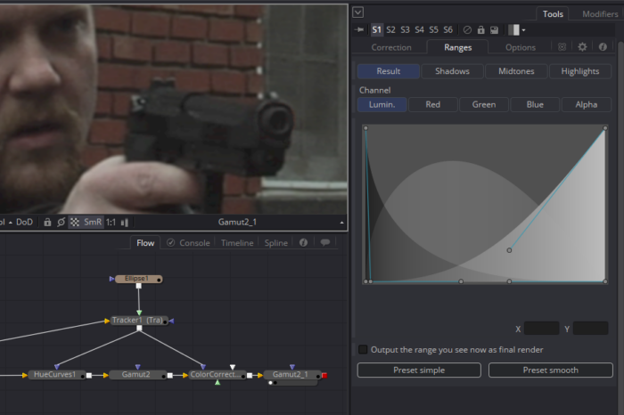
First, notice that I have branched the output of the Tracker so that it masks two different tools. The advantage of a node-based system over a layer-based one like After Effects is that I don't have to make copies and copies and copies of layers that I want to use several times. I can just pull another wire off the output and reuse that tool as many times as I like.
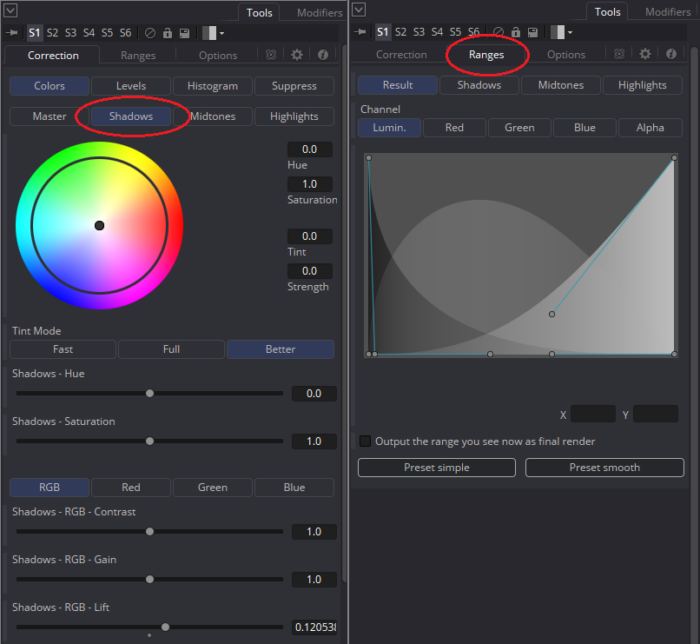
Next, you'll note that I have bracketed my Color Corrector with two Gamut tools. Like the Tracker, the Color Corrector was designed for gamma-corrected images, so some of its features work a little better if you put the image into sRGB first, then back to linear afterward. In this case, I wanted to use the Ranges to restrict my changes to only the shadow areas, and that's one of the features that breaks down in linear images.
I switched the Color Corrector to Shadows mode, which affects only the darkest pixels, leaving the mid-tones and highlights alone. I raised the Lift until the blacks in the barrel more closely matched the rest of the image. The barrel itself is pretty dark, too, though, so it was also lightened. In order to restrict the correction to only the pixels I wanted, I switched to the Ranges tab and adjusted the curve there until the barrel returned to the color I wanted but the shadows were still fixed.
A few quick play-throughs of the entire sequence show me that the color correction is pretty good. The orange fringe creeps in just a little bit, but it wouldn't take long to touch that up, and since the viewer's attention is probably on James' face, anyway, I doubt anyone would see it.
That small lesson covers the essentials of point tracking. The Tracker tool has a lot more functionality, and in later lessons we'll learn how to use it to stabilize footage, match rotation and scale changes, and pin elements to surfaces in perspective.
Other kinds of Tracking
I mentioned at the beginning of the lesson that there are two other kinds of tracking: Planar and 3d tracking. A point tracker like the one in Fusion is good at analyzing the motion of a small group of pixels that move together, like that gun barrel. A planar tracker tracks much larger areas that all belong to the same, roughly-planar surface. It can detect not only rotation and scaling, but also changes in perspective, allowing you to track objects that rotate toward or away from the camera. The most obvious use for planar tracking is to add burned-in video screens to computer monitors or smartphones, but it can also accomplish other, more complex tasks. The most common stand-alone planar tracker on the market right now is Imagineer's Mocha. After Effects users may already be familiar with Mocha because a light version is included with AE. Nuke has a planar tracker built-in, and Fusion added with with version 9, although it is restricted to the Studio version.
A 3d tracker is used to create a virtual copy of the camera that was used to photograph a clip. Dozens to hundreds of individual point trackers are used to track different features in the clip, and their relative motion is used to estimate the location and motion of the camera. 3d tracking usually relies on the presence of parallax in the scene—the difference in speed between objects that are at different distances from the camera. 3d tracking in combination with photogrammetry techniques can be used not only to recreate the camera, but also a 3d replica of the environment itself, extracting the locations and colors of objects from the clip and applying that information in 3d software, or even in Fusion itself, to create rough models. There are several popular 3d tracking programs available: PFTrack, Syntheyes, 3D Equalizer, and Boujou are all common in production. In addition, with version 9, Fusion Studio joined both Nuke and After Effects in having its own 3d Camera Tracker built-in.
Next Time
In the next chapter, we'll talk about Rotoscoping and Keying, which are used to make more complex masks than the ones we have seen so far. See you then!
< Previous Chapter: The Basics — Next Chapter: Rotoscoping and Keying >
in the Viewer Panels section, the Channels pop-up is said to show Z-depth and motion vectors, but in FS9 i cannot see this. i have made a short screencast to illustrate what i am getting: https://screencast-o-matic.com/watch/cFh2oJb4gB. maybe i am doing something wrongly?
If those channels don't exist in your image, they don't show up in the list. Normal photography doesn't generate depth or vectors.
thanks! that explains it. in apps like Premiere and many other apps i am used to parameters being greyed out, but Fusion behaves more like blender, wherein, if something is not applicable it isn't there in the interface. i think i prefer the adobe way because you can go and look things up, but this is the way Fusion is, and i will get used to it.
That would be impractical since there are 22 possible channels that Fusion understands. You wouldn't want to see that entire list every time you hit the pop-up, particularly since the vast majority of images you will look at have only RGBA.
22 channels in the UI would be excessive i agree. that's a lot of channels. anyway, i now understand both one more detail of Fusion and one more concept.
in the section on the Currently Viewed Tool, i don't seem to get both the nodes showing up when i am using A/B mode. see screenshot: https://www.screencast.com/t/iwv8sEofD4
not sure what i am doing wrongly or if perhaps F9 has changed cf F8?
It looks exactly correct to me. Buffer B is showing Merge 1, and Buffer A showing Loader1_1, which carries the image sequence GreenscreenCU. What is it you're expecting to see there?
i was expecting to see TWO Nodes highlighted in the Flow view. that is how i interpreted this sentence: "…the currently viewed tool button will select the tool in the Flow view. If you are in A|B mode, as in the screenshot, it will select *both* tools." i guess i have misunderstood these sentences – what does 'both' refer to?
But… they _are_ both selected in your screenshot. A Loader node is normally a light green color, and the Merge would be grey. You have one tool that has focus, and that is highlighted yellow. The other tool is highlighted blue.
yes, i see that now. as i explain in my screencast, i was getting some behaviour i was not expecting, though when i came to demonstrate it in the recording, Fusion behaved properly. ah well. also i was expecting nodes to be highlighted yellow, not blue or any other colour. i now know that highlights can be yellow or blue. maybe they can be other colours too. anyway, here is the screencast: https://screencast-o-matic.com/watch/cFh2qab48F. i note in this that it takes a bit of extra effort to clear both A & B views. no big deal, but i am glad i know what to expect now.
in the Spline View section, second para, the first line says: "The final two tabs in this window are the Comments and Generation Integration." at least in Fusion Studio 9.0.2 build 15, it says Connect – which is certainly an important part of the pipeline/workflow. not sure what it says in Fusion 9 non-Studio version or if Connect is in there. in Resolve Studio 15 beta 2, there appear to be no tabs similar to FS 9 (all i can see is the Node panel), but that is probably under construction. unfortunately it looks like one cannot install parallel versions of F9 and DVR 15 on the same machine, which is a pity.
I was still in Fusion 8 at this point. 9 was in beta. I still have no experience with the Connect feature for Generation, Avid, or Resolve—we don't interface directly with editorial at Muse, and I've not much interest in editing at home. That's a topic I was planning to research for the pipeline chapter of the book, but I haven't decided which way I'm going to jump with that chapter after the integration.
If you want information I haven't provided, there's a chapter on Fusion Connect in the Fusion 9 User Manual. It's definitely a Studio feature because it uses a script run from Avid to remotely control Fusion. I'm not sure how the Resolve end of it works—there's nothing in the Fusion manual about it, but I imagine it's similar: a script command to build the initial comp.
Fusion 9 and Resolve 15 can coexist on a single computer. Resolve 15 overwrites version 14, but it leaves all Fusion installations alone. I have Resolve 15, and three versions of Fusion installed simultaneously on my home PC (though 9 won't run thanks to my ancient processor). The only problem I am aware of with running Resolve and Fusion on the same workstation is OFX plugins. Some of them work fine with Resolve but will prevent Fusion from starting.
I'm trying to remove a moving complex object and replace it with transparency. I have done the planar tracker. Do I make a garbage matte and somehow fit it to the planar tracker start position and use tracker data? Can the planar tracker mask mode be used somehow?
After you've done your tracking, click the button that says Create Planar Transform at the bottom of the control panel. That will create a new node that has just the transform information. Go to the reference frame and draw your mask. Plug the Polygon or BSpline mask node into the input of the Planar Transform node, then plug the plate into a Matte Control and the output of the Planar Transform into the Garbage Mask input.
It can be tricky to animate a spline through the Planar Transform since Fusion doesn't always update its location accurately. Sometimes you have to just touch a control point, and the spline will snap into its correct position.
The mask inputs on the Planar Tracker itself are used to prevent the node from processing the masked areas. The Occlusion Mask input allows you to designate an area where the tracker won't attempt to detect motion. For instance, if there's a foreground object that crosses the surface you're tracking, you can mask it out so the tracker doesn't get confused. The Effect Mask input can be used to mask out something that you don't want to see in the output corner-pinned image. It doesn't affect the tracking, but it does affect the output pixels.
Generally speaking, once I'm happy with a track, I usually just create the Planar Transform and delete the Planar Tracker itself, even if I'm doing a corner pin. It has quite a bit of data in it that makes the comp file larger. And using a Corner Positioner into the Planar Transform gives you the ability to animate the corner positions in case they drift a little, which you can't do in the Planar Tracker itself.
Thanks. So I need to outline frame 1 with a polygon for the matte the same way I drew a polygon for the tracker on frame 1?
The complex object, which has a base at the bottom of the screen, does indeed get partially blocked several times, even fully blocked on the base edge of the screen. I've been manually trying to adjust the planar tracker polygon outline of the object and wasn't sure how to handle it being blocked. Just doing it frame by frame when the tracker loses it. I was also letting the tracker polygon go off-screen when the object is fully covered over, then adjusting it nearly frame by frame as the object (which doesn't track well as it's too similar to the background) gradually re-appears from the edge.
It goes off-screen several times, so it is cumbersome to go from no object to track, to then tracking the object as it slowly becomes clear and fully seen.
So instead of manually doing that, you say a mask could be used to help the tracking? How does that work?
For when the object is completely covered by something, can I draw a polygon from beyond the point where the object is fully covered and track backwards and meet in the middle, or does the tracking polygon have to be continuous from the start?
Sorry, I somehow missed your reply. I don't use the planar tracker much because Mocha is strictly superior, and I have that. My understanding, though, is that changing the tracking spline's shape does not affect the underlying tracking data. If your target object is fully occluded, the tracker during those frames will just be still, and it will pick up from where it left off when the occlusion is gone. Moving the spline won't cause the tracker to move. You'll probably need to do some hand animation with a Transform node in between your Planar Transform and whatever you're applying the mask to in order to line it back up with the object. The Planar Transform unfortunately doesn't have anything useful in the Spline Editor to adjust in that kind of situation.
The tracking spline doesneed to have continuous data in order for the tool to work, but that data doesn't necessarily have to be valid. The nice thing about having the tracker right there in Fusion is that you have the tools to repair the problem. You could even chain two or three trackers together. Say one of them tracks from frame 1 to where the first occlusion starts, then the next picks up from where the occlusion ends onward to the next, etc. Then your finished flow would look like Mask -> PlanarTransform1 -> Transform (for estimating the motion during occlusion) -> PlanarTransform2 -> Whatever tool you're masking. As long as the transforms are all next to each other (no grid warps or blurs or anything between them), the transformations will concatenate. That is, the mask will only be filtered once and won't get blurry.
Thanks. When u have multiple tracker nodes, u can set the start and end point of the first, then a separate tracker node starting 1 frame later to the end of its relevance?
There isn't an option for setting in and out points. Just set the reference frame at the frame where you want the new tracker to pick up and don't track back into frames where another node is handling the motion. Delete any keyframes from other trackers that overlap with the one you're passing control off to.
With the normal point Tracker you don't have to do this kind of thing because you can just move the keyframes to wherever you need them to be, but the planar tracker needs a little extra help.
I should add that if you don't actually need the planar tracker, the point tracker is much more mature a tool and easier to work with.
Thanks again. Is the point tracker less accurate than the planar for some situations? Perhaps if objects and boundaries and contrast are not very distinct?
As with everything in compositing, it's highly situational. Sure, there are definitely situations where the point tracker will get you nowhere. There are also situations where the point tracker is the only solution that will work. And there are some shots that you just have to bite the bullet and animate by hand. As a matter of fact, I have one of those on my plate right now—super shallow depth of field, monochromatic lighting, and very few background features.
Correction
"Starting with the upper-left, we have the SubView button…"
*bottom-left
The upper left of the two rows of buttons visible in the screenshot. Bottom left would be the lock viewer button in that image.
Oh.. I probably lost the connection with the previous lines after studying UI image 😛
It's a good note, though: It's obviously not as clear as it might be. Maybe I need a more focused screenshot of just those buttons. Although with the integration into Resolve all the screenshots are obviated, anyway. We'll have to see what the UI looks like if and when they release a new standalone version, but I suspect that these buttons won't look anything like they do now.