The following article is a chapter in a forthcoming compositing textbook. There are references to chapters and appendices that have not yet been written. As those chapters are completed, I will link to them. For now, please be patient.
Last time we covered importing footage with Loaders, handling color space with the Gamut and CineonLog tools, the Viewports and Time Ruler, and rendering out the finished product with a Saver. There wasn't much in the way of actual finished product to be had, though, so this time around we'll construct a simple composite and learn about some of the most important tools in the compositor's kit: Merges, Color Corrects, Transforms, and Masks.
You can use your own assets for this lesson if you want. In fact, I'd encourage it. If you don't have any suitable footage or images, though, I have prepared some tutorial assets, which you can download here (61 MB Zip archive).
Lesson the First: Merges
The compositor's job is to seamlessly blend elements with footage so that it looks like everything in the final shot was photographed at the same time with the same camera. The tool most often used to accomplish this feat is a node called Merge. Nuke artists will already know exactly how this works, but if you're coming from After Effects, you seldom have to think about it thanks to the layers paradigm.
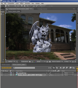
In AE, you have an easily-understood visual stack of layers. The layers at the top are "over" the layers at the bottom.
Here we see an AE comp where the gargoyle layer is above the plate layer, so in the viewport, the gargoyle's pixels are rendered over the house's. The gargoyle has an alpha channel, an extra, invisible channel that tells the software which pixels are transparent.
In Fusion and Nuke, we don't have a stack of layers, just a lot of nodes. To get the same effect, we use a Merge node, which has two inputs (yes, there are actually three—you may have noticed that most tools have an extra blue input. That's for masking the tool, a topic we'll cover below). One of them is designated the background, and the other is the foreground. In Nuke, we chant "A Over B" to remember which one goes where (or I do, at any rate). In Fusion, the Background is always the gold input.
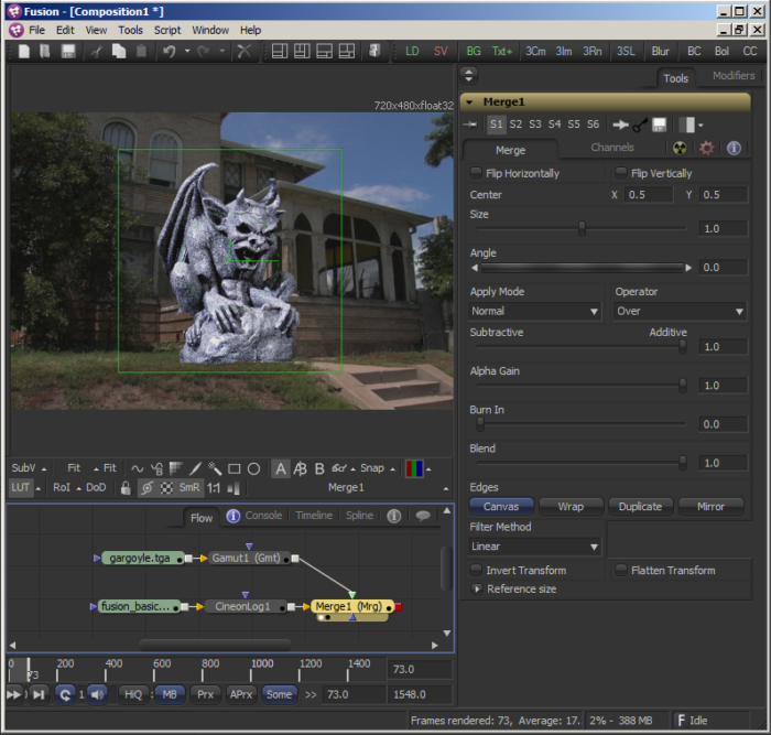
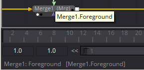
Here I have two loaders: One is the gargoyle and the other is the house. Each has been converted to linear color space by the appropriate method: sRGB to linear with a Gamut tool and logarithmic to linear with a CineonLog tool. I want the house to be the background, so it goes into the gold input, and the gargoyle goes to the green. If you forget which is which, just mouse over the input you're interested in, and its name will appear in the Status Bar at the lower-left corner of your screen, or if you wait a moment, it shows up in the tool-tip.
You can also see that there are some controls visible in the Viewer. Fusion's Merge tool includes some Transform controls in addition to the layering controls. You can move, resize, and rotate the foreground. Generally, I avoid doing so because it's easy to forget about those transforms, much like it's easy to overlook the color management settings in a Loader. Instead, I will place a Transform node between the Gamut and the Merge when I am ready to position the gargoyle. First, though, let's look at the Merge's control panel.
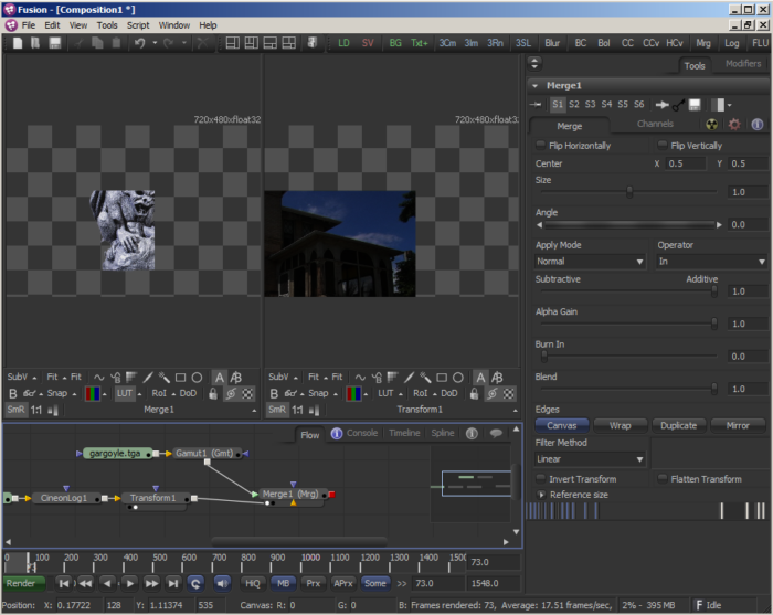
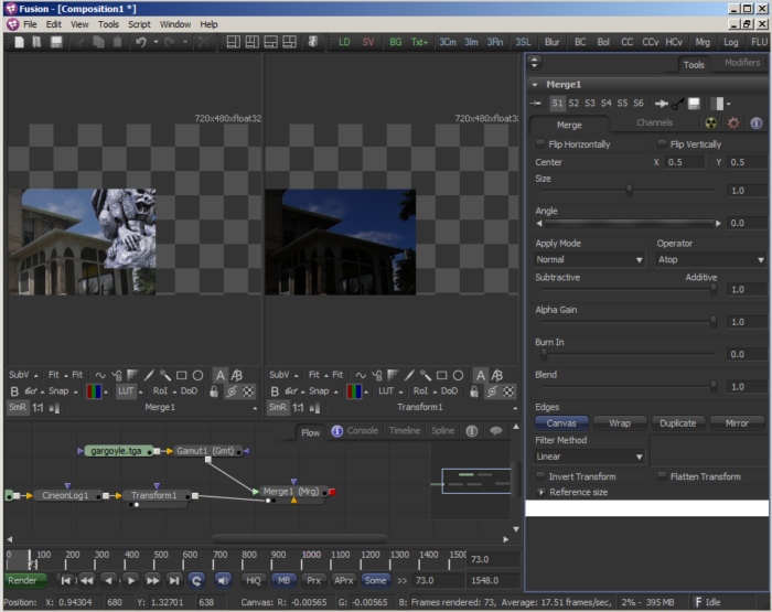
The first few lines are the Transform controls, so we'll skip those for now. After that comes the Apply Mode and Operator. Apply Mode is equivalent to the Blend Modes in After Effects and Photoshop, and many of the same blend modes are available there. The Operator is only visible if Apply Mode is set to Normal. Most of the time, the default Over is what you want, but there are occasions when the other modes can be useful. In displays only the Foreground, and only "In" the alpha of the Background. In this image, I have Translated the Background so that it no longer fills the entire frame, as shown in Viewer2. Viewer1 shows how the Gargoyle has been trimmed so that only the pixels that are inside the background are visible. In this mode, the background is not displayed.
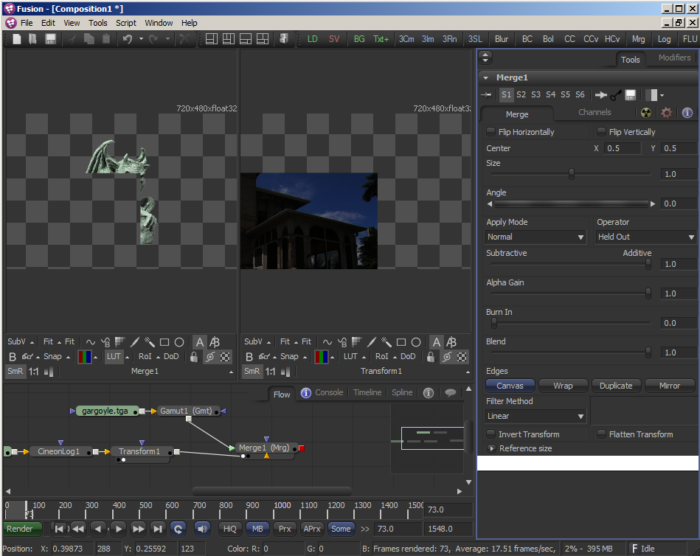
If I switch the Operator to Held Out, the opposite effect is achieved: The Foreground is only displayed where the Background doesn't exist.
Atop is similar to In, except that the Background is displayed as well:
 And finally, Xor is short for "Exclusive Or," and it will display both Foreground and Background, but any pixels where they overlap are hidden:
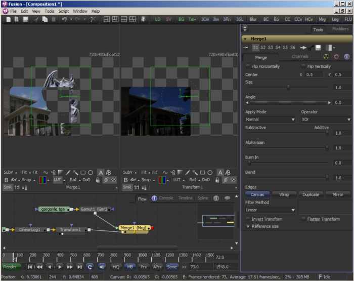
99% of the time, the only modes I use are Normal/Over, Multiply, Darken, and Lighten. The others are useful every so often, though, so it's good to know that they're there.
The next few controls change the way the alpha and foreground pixels are blended with the background. I will go deeper into the math behind all of these controls and the blend modes themselves in an appendix to this chapter. For now, the ones you are most likely to want to use are the Alpha Gain and Blend sliders. Alpha Gain dials back the amount that the Foreground's Alpha cuts out the background. Setting it to 0.0 means that the Foreground and Background are simply added together, like the Plus mode in Nuke or Add in After Effects.
Blend is the same as the Opacity control in After Effects or the Mix slider in Nuke. It can fade out the Foreground layer. At 0.0, the Foreground is not visible at all. In a Merge, it is most often used to create transitions or hide a layer when it is not needed.
Lesson the Second: Transforms
The objective with this little composite is to place the gargoyle on the ledge next to the porch steps. I mentioned a few moments ago that the gargoyle can be moved around, resized, and rotated in the Merge tool itself, but we're going to do all of that work in a separate Transform instead. To add a Transform tool, select the Gamut node and find the Transform using the method of your choice. In the toolbar, it's labeled "Xf," and in the Insert Tool context-menu it's under "Transform." Make sure you're viewing the Merge node but have the Transform node selected.
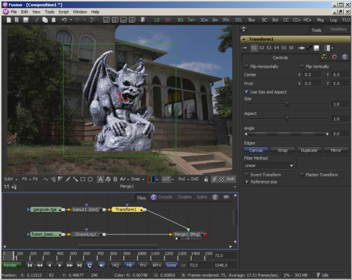
As you can see, there are some widgets overlaid on the image in the Viewer. The large green box indicates the bounding box for the gargoyle and can be used to scale it. The red arrow handle is for x- and y- translation, the dotted green circle is for rotation, and the green X is the pivot point, which is a reference point for the scale and rotation controls. If you click on one of the controls, it will turn red and the others will turn green, so you always know which control is active.
You can also control these transforms with the appropriate sliders and numbers in the Tools window. Translation is controlled by the Center, and because it does not have sliders, it is usually easier to use the graphical widget. Pivot is a special case. Because it starts in the same spot as the Center, it is impossible to select it in the Viewer. If you need to move it, change one of its coordinates in the control panel to move it away from the Center control, and then you'll be able to drag it wherever you need it to go. You can also use the pop-up menu in the lower-right corner of the Viewer to select it or use the Tab key to cycle through the active widgets. Be aware that since Angle and Size both reference the location of the Pivot, if you have changed either of those values, moving the Pivot will likely cause your image to slide around unexpectedly.
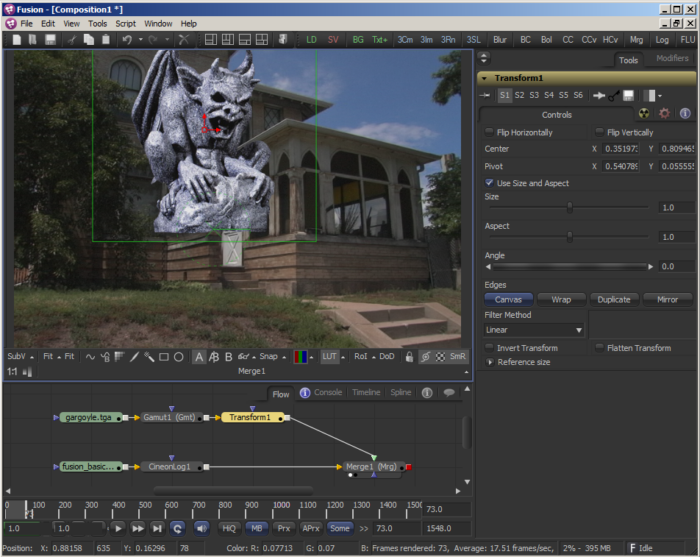
In the above image, I have moved the Pivot to near the bottom of the gargoyle's pedestal and then translated using the Center control so that the pedestal is on the ledge. He's still huge, though, so the next step is to use the Size control to shrink him down:
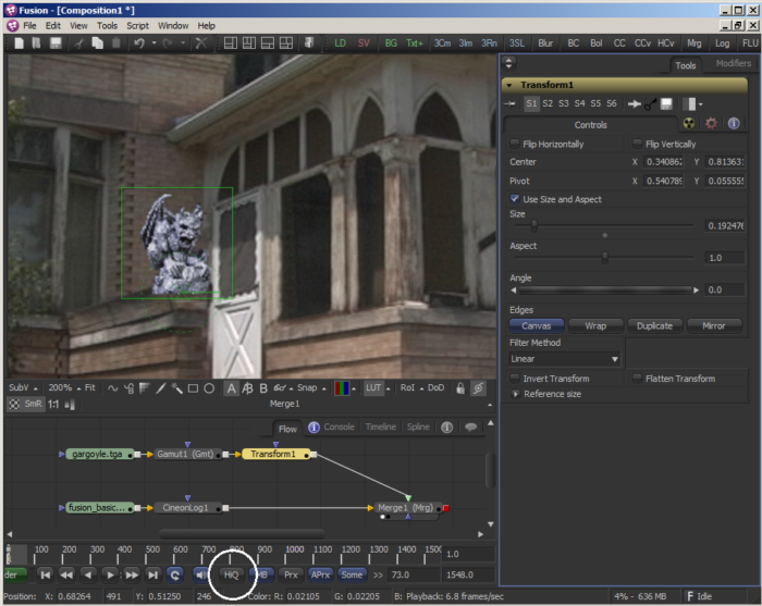
He looks awful. For some reason he got all pixellated and crunchy when I scaled him down. The reason for that is due to one of the most evil buttons in computer graphics: The High Quality button. For some reason, this button is turned off by default. It's literally a "suck button." Turn it on, and whatever Filter Method is selected in your Transform will be applied immediately. Fortunately, as long as you don't select Preview in the Configurations field of the Render Settings, Fusion will render with High Quality on, even if the switch itself is off. While you're down there looking at those buttons, let's go through them:
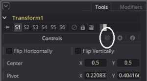 MB is for Motion Blur. This is a global switch that simply enables the motion blur system. In order to actually see any blur, the motion blur switch must be activated in the appropriate node. Any tool that has Transform controls will have a Motion Blur switch in its Common Controls tab, which is accessed with the little radioactive icon in the tool's control panel in Fusion 7 or… I think it's meant to be an atom with orbiting electrons in Fusion 8. In any case, it's to the right of the Controls tab. I'll cover motion blur in more depth in the Cameras, Lenses and Sensors article.
Prx is the Proxy system. If you right-click the button, you can choose the proxy level—how many times the resolution will be divided before processing. If you put it on 1 and activate it, Fusion will load any Proxy file sequences designated in the Loaders rather than the actual footage. This lets you use, for instance, a full-res locally-cached jpeg sequence instead of a much heavier dpx sequence stored on a network share. In this mode, the only thing that changes is which footage source is used. If you haven't set a proxy sequence in your Loader, it does nothing. If you set the proxy to level 2 or higher, then the image will be reduced in resolution before any processing happens, resulting in a much faster comp at the cost of less accuracy. This is the same as using the downrez control in a Nuke Viewer or the Resolution/Down Sample Factor in AE. Like HiQ, Fusion will deactivate Proxy mode when rendering unless you choose Preview in the Configurations field of the Render Settings window.
Aprx stands for Auto-Proxy, and it is similar to the Fast Previews switch in AE's viewer, or Adaptive Degradation in 3DS Max. I am not sure if Nuke has an equivalent feature. I always turn it off in both AE and Fusion, so I never went looking for it in Nuke. It reduces the resolution while you're moving a control, then renders the full-resolution as soon as you release it. Handy if you have a very heavy comp and want to drag sliders around without waiting for an update, but not so hot if you need to actually watch the results of moving the slider while you do it.
Finally, another frustrating button: Selective Rendering, which is hopefully set to "Some." This button lets you choose which nodes are processed when a change is made. In the default Some mode, only nodes that contribute to the viewed image are processed. In None mode, no nodes will process. This can be helpful if you need to make several changes in tools that take a long time to process, like particle tools or a 3d system. You can turn it to None temporarily while you make your changes, then switch it back when you're done. In All mode, Fusion processes every node in the flow, regardless of whether it's contributing to anything. Even Tools that are completely disconnected will be updated. The only time you might want to use this mode is if you have some branch of your tree that generates data that is somehow not actively queried by the rest of the flow. I don't think I have ever needed to put Fusion into All mode, but sometimes it seems to happen spontaneously. If your comp suddenly slows to a tremendous crawl and seems to be accessing nodes that have no business lighting up, check the status of this button.
Okay, rabbit trail over! Let's get back to the Transform. In my comp, with the HiQ button now turned on, the gargoyle looks a little blurrier than the house. The default Filter Method (check that appendix for more on filtering!) for most tools is Linear, which can soften the image quite a bit, particularly when you take it down as small as I have done here. Changing the Filter Method doesn't seem to do anything, though. The trick to that is, like Nuke, Fusion concatenates adjacent transforms. That is, unless a chain of transformations is broken by some other operation, like a color correct or a blur, Fusion waits until the end of the chain before it applies its filtering. In this case, it means that the transform controls in the Merge are the ones actually controlling the Filter Method. There are then two ways to get the desired Filtering Method to apply. You can go downstream to the last appropriate transform control, the Merge, and change it there, or you can activate the "Flatten Transform" button. Flatten Transform breaks concatenation at this point, telling Fusion to apply the filtering before passing the image downstream. Anything upstream of the flattened button will still concatenate, but if you put in another transform, or perform a translation in the Merge, your image will be filtered again, which can rapidly degrade its quality. If you activate Flatten Transform, it's a good idea to add a Note node right next to the Transform to remind yourself that you've done it.
In any case, for this gargoyle, I have chosen the Catmull-Rom method, which is a sharpening filter. You do have to be a little careful with sharpening filters because they can create negative pixel values. In this case, the gargoyle's eyes and the darkest part of the underside of the wings have gone into the negatives.
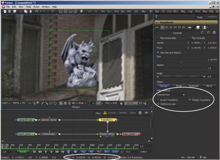
In the above image, I have circled the Filter Method and Flatten Transform controls, as well as a readout of the negative pixel values in the gargoyle's eye. To display those numbers, simply mouse over any pixel in your Viewport. The values will appear in the Status Bar.
Those super-blacks aren't going to be a problem for this comp, though, because in the next lesson, we're going to do some Color Correction!
Lesson the Third: Color Correction
Perfect integration of an element with a plate depends on a similarity of lighting and color between the foreground and background. If you happen to notice a bad composite in a film or on TV, chances are one of the things that drew your eye was mismatched black levels. For some reason, most compositors tend to make CG or integrated elements just slightly too dark for the rest of the plate; I'm not sure why. So the place to start is to match the darks between our gargoyle and our house.
First step, we need a ColorCorrector node. In the toolbar, it bears the abbreviation "CC," and in the context menu it will be found, appropriately, in the Color folder. As discussed above, if you place a non-transform tool between two tools that have transform controls, you will break the concatenation. Therefore, you should avoid inserting the Color Corrector between the Transform and the Merge. If you do, you'll break the concatenation and risk filtering twice. That won't actually happen unless you perform a transformation in the Merge, but it's a good habit to get into to group the Transforms with the Merges and keep other tools from interposing between them whenever possible. Thus, the Color Corrector should go between the Gamut and the Transform. (You could also place it before the Gamut, but you'll get slightly different results. Again, that's a topic for another time. For now, just keep it after the Gamut for ease in following this tutorial.)
The Color Corrector is a very big and complex tool, and it can be intimidating the first time you look at it. We're only going to deal with a couple of the controls, today, though.
Matching the black levels is done with the Lift control. Lift moves the darkest pixels up or down, leaving the white point in place and either compressing or stretching the pixels in between. Fusion's Lift is extremely twitchy; Nuke has a much better logarithmic slider system that makes small changes when close to zero and larger changes as you drag. Since we don't have the benefit of such a slider, we need a way to make the slider we do have much less sensitive. If you hold down Ctrl while dragging any slider, the changes you make will be much smaller.
Once you start dragging the Lift control, you'll run into another "gotcha." Since Lift makes all of the black pixels brighter, including those that have 0 alpha, the entire image will get brighter, instead of just the gargoyle. In order to maintain the gargoyle's correct background color of black, we need Fusion to multiply those background pixels by the alpha channel again (this is another topic I will cover more deeply later on). If we do that, though, the edge pixels, which are partially-transparent, will be multiplied twice, becoming darker than they should be and potentially creating a black halo around the element. In order to maintain the proper brightness of the edge and yet still knock the transparent pixels back to black, we need to first divide the color channels by the alpha (what's that? We can't divide by 0? Don't worry; there's a little bit of math trickery that Fusion takes care of behind-the-scenes that makes it okay), then perform the color correct, and multiply by the alpha once again to knock out that brightened background. Back in the days of Shake, you had to actually bracket color corrects with nodes to perform this procedure, but Fusion and Nuke fortunately provide a handy checkbox. In the Options tab, find the Pre-Divide/Post-Multiply checkbox and toggle it on. (Nuke users: Yes, Fusion's terminology is a little confusing. Most software refers to pre-multiplying for the benefit of the next operation. Fusion refers to post-multiplying after the previous operation. AlphaDivide does the same thing as Unpremult.)
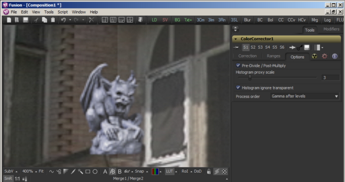
This image shows the results of activating the Pre-Divide/Post-Multiply button on the left, and the same color correction with the button turned off on the right. Notice that the gargoyle's color is continuous, but the house is washed out in the right half of the Viewer.
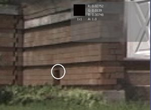 To find the appropriate black level, you will want to examine the image and try to find the darkest pixel with similar lighting. In this case, we should discount the very dark pixels in the windows of the house because they don't represent the same kind of light as is falling on the gargoyle. Instead, we should sample a shadowed area of the ledge that seems to have similar reflectance qualities as the gargoyle itself. This image shows a likely spot (I have a tool that can help to find the darkest pixel—I will share it when we cover Macros. For now, eyeballing the plate is usually good enough), and I have turned on the sub-view so you can see the actual values at the spot I have chosen.
It appears that the darkest pixel on the gargoyle is the single pixel in his nose, so that's the pixel I will try to match to the one that I've sampled. Sampling that pixel shows that the lowest value is in the blue channel at -0.04919. The first thing I'll do is set my RGB Lift control to 0.04919 to bring all of the channels out of the negatives. Although I expected that to give me a value of 0.0 in the blue channel, my sampling shows that the value is actually 0.00242. I forgot to account for the Catmull-Rom filtering. A sharpening filter works by increasing contrast at border regions. As a result, it's difficult to predict what effect a color correction will have in contrasty areas. In this case, it caused me to make a small overcorrection. I'm still pretty close to where I wanted to be, though, so I'm not going to sweat it. Absolute mathematical precision can be fun (for some of us), but sometimes it takes longer to achieve than it's worth.
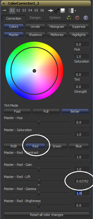 The next thing I want to do is to match each channel's value independently. In this image, I have circled the channel button that will let you access controls that affect only the red channel. As you can see, I have inserted the red channel value I got from sampling the black point in my plate into the Red – Lift control. I do the same for Green, and when I am done, the darkest pixel of my gargoyle is the same color as the darkest pixel of the wall. (Blue was already taken care of by the RGB Lift.)
However, the wall is red brick, and the gargoyle is neutral gray concrete. So by matching the black levels exactly, I have tinted my gargoyle inappropriately. In order to bring it back to the correct color, I reduce the Red – Lift value slightly until the sculpture's color has returned to neutral.
At this point, the gargoyle no longer looks like it has such hard, dramatic lighting inappropriate to the scene, but it's become a little washed out. Here's a comparison of the corrected image with the original:
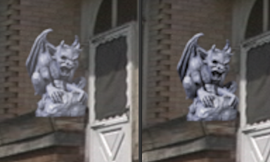
It is tempting to immediately reach for the gamma control to bring the midtones back to something more pleasing, but first we should match the white points. In both the foreground and the background, we have easily sampled direct light. On the house, the brightest point is the bevel in the bottom half of the door. It appears to be almost perpendicular to the sun's rays. Sampling it reveals levels of 0.9846 in all three channels. It was probably clipping the sensor (I shot this video with a Sony PD-150 DV camera, so I did not have much dynamic range to work with), and therefore going to full white with no tint. That's perfect for our purposes since it means we don't have to do any color balancing of the white point. The brightest point on the gargoyle looks like it's on the pedestal. Just like we did with the black point, sample the brightest pixel and take note of its values. I show about 0.77 for red and green and 0.79 in blue. Turning 0.77 into 0.98 is as simple as adding 0.21 to the Gain, and that is exactly what I do. Gain does the opposite of Lift. It leaves the black point where it is and only changes the white point. Pixels in between stretch or compress their values to compensate. Once again, the Catmull-Rom filter adds a little chaos to the color correction, and my pixels don't quite reach 0.98, but I think at 0.95 they're close enough. I could tweak it a bit more, but I think we can get by with assuming that the concrete is slightly darker than the door.
Now it's time to reach for that gamma control. Gamma leaves both white and black where they are and changes the midpoint. As the values get closer to black or white, the strength of the gamma falls off, resulting in a curve. It is usually difficult to find a perfect mid-gray tone in either image, so it is common to adjust the Gamma without reference to any sampled colors. Just tweak it until it looks right to your eye. This is also the point where you might add a color cast if you need to match the overall tone of the plate. In my case, I thought the gargoyle seemed a little cold in hue, so I reduced the blue gamma, making him a bit more yellow, as though he is reflecting some of the color of the tan bricks. Here is my color-corrected gargoyle on the left and the original on the right:
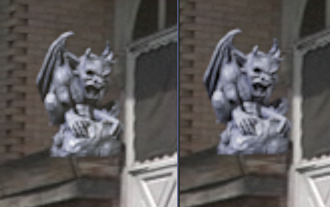
The change is subtle, but he sits better in the image now. I might still make a couple more adjustments, like pulling the gain down slightly. He still looks a little sparkly in comparison to everything else in the shot. He might also still be a bit big, but I will re-evaluate that once I have masked out the ledge.
Before moving on, I'd like to point out that adjusting the Gamma can have the side effect of also altering the saturation of your image. Saturation is the intensity of the color. Reducing the gamma tends to increase saturation. This effect can be countered using the Saturation slider in the Color Correct.
Animating the Color Correct
Now that you have the gargoyle matched nicely to the plate, I have a curveball to throw at you. If you play the sequence, you will notice that the brightness of the plate changes. In order to keep the gargoyle matched to the plate, we're going to have to animate the color correction. Almost every control on a Fusion tool can be animated. A few of them, like spline paths, are animated by default, but most of the time you have to turn on animation for any property you want to change over time. In this case, we're going to adjust Master – RGB – Gain to match the exposure changes I was making when I set up the camera. Right-click the label for the control and choose "Animate" from the context menu. You can also right-click the slider itself, but sometimes that changes the value. The numeric field turns green to indicate that it is animated and there is a keyframe set on the current frame. In addition, a green hash mark appears on the Time Ruler.
Move the playhead to the frame where the image brightness stops changing—that's frame 5 on my timeline, but probably frame 4 on yours if your comp begins at frame 0 (I set mine up to begin at frame 1). When you change the Gain control at this frame, it will automatically add a new keyframe, and Fusion will interpolate between the two keys during the frames in between. The default interpolation mode is linear; later on I'll walk you through the Spline view, where you can adjust the keyframe interpolation.
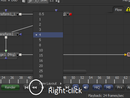 You could just eyeball the amount of Gain change that you need, and most of the time that's good enough, but let's try for better accuracy instead. The distance between our start frame and our target frame is conveniently four frames. In order to easily move back and forth between these two frames, set the step size to 4. Right-click one of the Play or Step controls, and choose 4 from the context menu.
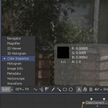
Now, using the [ and ] keys, you can step back and forth between frames 0 and 4 while leaving your mouse pointer in the Viewer. The pixel sampling in the status bar doesn't update unless you actually move the mouse, and that will give us a little bit of inaccuracy in sampling the image. Instead, we'll use the Color Inspector SubView, which updates continuously. To turn it on, click the SubV button in the lower-left corner of the Viewer window, then use the pop-up menu button to select the Color Inspector. The SubView will appear in the upper-right corner of your Viewer, but you can drag it to wherever you like.
Find a fairly bright pixel, but not one that is too close to that clipping point of 0.98. Since the camera clipped off all data that was brighter than 0.98, we don't know what the actual brightness of those pixels was. No matter how high the exposure goes, their value will not change. I found a good pixel at 0.738 on the door. Leaving the mouse in place, use the [ and ] keys to step back and forth between frames 0 and 4. Take note of the difference in value between these two frames. The pixel I sampled changes from 0.738 to 0.82, for a difference of 0.09.
You can make calculations inside the numeric field. Set the playhead and frame 4, place your cursor in the field after the existing number and simply type "+" and the difference you calculated. In my case, I have "0.712381+0.09". A new keyframe appears, holding the adjusted value. Now the gargoyle's brightness changes with the plate.
There is another brightness change from frame 15 to 24. Repeat the process I've just shown you to see if you can keep the gargoyle matched to the plate through that change, also. To set a keyframe without changing the value, right-click on the control's label and choose "Set Key." You can remove a keyframe the same way, and if you decide you want to remove the animation entirely in order to start over, right-click and choose "Remove ColorCorrector1MasterGain," which is the name of the spline that is modifying the slider.
Continue the process to the end of the clip, finding places where the brightness changes and matching them by animating the Gain control. When you're finished play the clip and see whether the gargoyle looks like it's receiving the same exposure changes as the house. You might need to make some minor adjustments based on your own sense of aesthetics—the presence of noise in the plate can make absolute brightness measurements inaccurate.
Lesson the Fourth: Masking
The last thing we need to do before we wrap up this project is mask the gargoyle with the ledge he's sitting on. The usual method is to use a Bezier spline to create a matte that is fed into the blue mask input of the Merge node. There are, of course, several other ways of masking an image, which I will cover in detail later on. For now, create a Polygon node. The toolbar button for a Polygon is the one labeled "Ply." Or, of course, you can use the Add Tool context menu or the ctrl-space method.
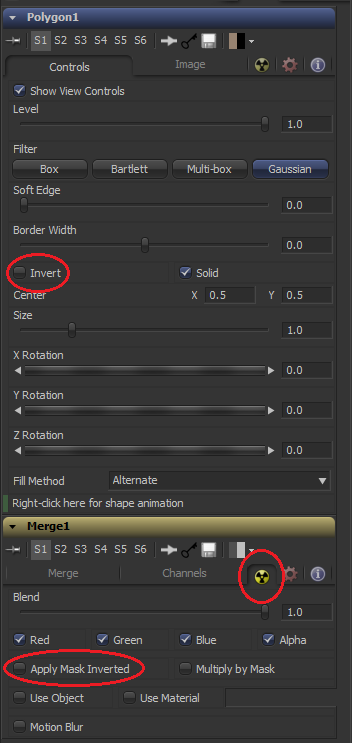 Connect the output of the Polygon to the blue input of the Merge node. The gargoyle should vanish entirely. The default behavior is for the foreground to only appear where the masking channel is white. Since the Polygon does not yet have a spline in it, its output is black, and the gargoyle is therefore completely masked out. In this case, though, we want to make a positive mask of the ledge to block the visibility of the gargoyle. In order to make that happen, you can either use the Invert checkbox in the Polygon tool or, in the Common Controls tab of the Merge node, check "Apply Mask Inverted."
In the image, I have circled both of these switches, as well as the symbol for the Common Controls tab, which is indicated by the radioactive icon and, as you likely expect, is common to all of Fusion's tools. (A reminder: in Fusion 8, the Common Controls icon has changed, but it's in the same place).
Once your Merge is set up the way you want, it is time to draw the spline. Simply click where you want the corners of the spline to appear in the viewport. Just like the Pen tool in After Effects or Photoshop, if you click and drag, you will get a smooth curve with control handles. You will probably find it a little easier to find the edge of the ledge if you are viewing the house Loader while you draw your spline.
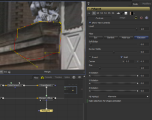
Here you can see the Polygon node plugged into the Merge's mask input as well as the spline I have drawn. I changed one of the points in my spline to smooth (select the point and Shift+S) to illustrate how the Bezier handles work.
If you deselect the Polygon, you will be able to see the masked gargoyle. The footage is not razor-sharp, but the mask's edge is, so we need to blur it a little bit to make everything match. Use the Soft Edge control in the Polygon tool to slightly blur the matte. Like the Lift slider we encountered earlier, Soft Edge needs only a very tiny value, so hold down Ctrl while dragging the slider to get more precision. Adjust it by eye until the amount of blur between the statue and the ledge looks the same as the blur between the ledge and the house. I wound up with a value of about 0.0013.
Blurs in Fusion can be a little tricky because, unlike most software, the radius does not refer to pixels, but to a percentage of screen width. So a Blur Size of 0.1 means the blur's radius is 10% of the screen width. In After Effects or Nuke terms, a 1 pixel blur radius on this image, which is 720×480, is 0.00139. As a consequence, if the resolution of your image changes, the Blur Size or Soft Edge might also need to change.
Wrapping it Up
In this article, we have covered the foundational processes in visual effects compositing: We learned how to Merge one image with another, how to Transform an image to get the size and position we wanted, some Color Correction and animation of a tool's properties, and how to mask and image using a Polygon spline.
In the next chapter, we'll learn an important supporting skill for the compositor: Motion Tracking. We'll also look more closely at Fusion's interface and its Viewers.
There is an appendix to accompany this chapter that details the mathematics of a Merge, each available Blend Mode, and the different kinds of filters.
< Previous Chapter: Getting Started — Next Chapter: Tracking >
Hey Bryan, Thanks for all your hard work in writing up all this info, it's been very helpful. Did you ever deposit the tool you made for finding the brightest /darkest pixel? thanks again.
You know, I completely forgot about that when it came time to write the Macros chapter! I don't have the time to describe its construction at the moment, but here's one version:
http://www.bryanray.name/files/rangeFinder.setting
To use it, connect the image you want to analyze and view the macro. Assuming there is nothing out of range (below 0 or above 1) to start with, the image should be black. Holding down Ctrl for finer control, move the Find Darkest slider to the left until you see at least one red pixel. There are two Position controls—move the one that's in the lower left over the red pixel. You may need to zoom in quite a bit to make sure the control is over the pixel. It also helps to turn off Smooth Resize. Follow the same procedure for the Find Brightest control, except you'll move it to the right. Once you've found both the brightest and darkest pixel, check the "Show Result" box, and the output will change to two solid rectangles. The one on top has the RGB value of the brightest pixel, and the one on bottom has the RGB value for the darkest.
I've left it as a Group instead of a closed Macro so you can examine what's inside and see how it works. A variant that addresses the channels individually would be a good idea, but I'm going to be late for work as it is! See if you can't figure out how to do it on your own, and if you get it working, share it!
Thanks for the macro and taking the time to write up the instructions, it works a treat. I did have an idea to make the tool more 'automatic', unfortunately I don't have time to play around with it as the deadline looms. Thanks again for the help.
Hi Bryan,
Your post on Fusion is spot-on! A excellent source of information to come back to. just want to say they are of great value to me and I appreciate them a lot. When your book is out, I'll be happy to order one.
I like the little oh by the way (gotcha) things like the blur size and being careful about placing nodes when you have concatenated transforms. But I have one note to make. In the masking section you show CRTL-s to smooth a point in the polygon mask. CTRL-S is a standard Save function. I believe that SHIFT-S is to smooth and SHIFT-L to go back to linear. Only getting started with your book and looking forward to seeing and learning more about Fusion. Thank you for this.
Right you are! Thank you!
Hi Bryan, this info is gold. Have you released the book yet?
It's on indefinite hold until such time as a version of Fusion with a finished UI is released. I'm not going to take a bunch of screenshots with those magic wand icons everywhere, only to have to redo them all when either the icons are completed or they come to their senses and go back to text labels.
Hello Bryan,
I'm new to compositing in general and also to Fusion, and find your explanations clear and useful. I'm very much interested in understanding the math behind the scenes. Were you able to add the appendix to the math processes of blend modes and image processing in general? or are there beginner friendly resources that you can suggest? Thank you for the incredible work.
If I remember right, it was about 80% complete. I suppose I could publish it as-is with a note that it's unfinished. Not like the rest of the book is in a fit state to publish!